Gespeichert von velocity am


With our project would like to point out, that bicycling is much better than driving a car. Here are just a few examples:
- You don’t get stuck in a traffic jam
- You are outdoor and get some fresh air
- You do something for your health
- You do something for your shape
- ...
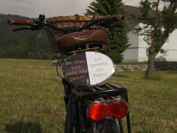
We designed some signs, that can be attached under the saddle of the bike. Our target group are people, who are interested in taking care of the environment and also want to stir the so-called CO2-Villains. For the project it was very important for us, that our target group is able to adjust the signs in an easy way and furthermore in a cheap way.
The Design
The backgrounds of the signs are always black & white. Whereby the street is meant to be black and the bike trial is white. Colours are only used for the fonts.
For the backgrounds we decided to make templates in Photoshop and that we are starting with 2 designs. One really with a street and a bike trail and one only with black and white background. These designs could be expanded if the project gets popular.
How to use the signs:
- Download the Wordfile on this page and open it in Word or Open Office.
- Choose one of the suggested wordings on the pages 3 – 6 or make up your own.
- Copy the wordings into the templates on Page 2
- Print the signs out
- Cut them out and punch them
- Laminate the signs and cut them out.
- Make holes and attach the signs with a string on your saddle or another place on your bike, so that a car driver is able to see them.


1 Kommentar
Endlich hat der Upload
Gespeichert von velocity am
Endlich hat der Upload funktioniert! :)